
Headway Shropshire
Brand identity
An optimistic new identity for a local charity supporting people affected by brain injury.
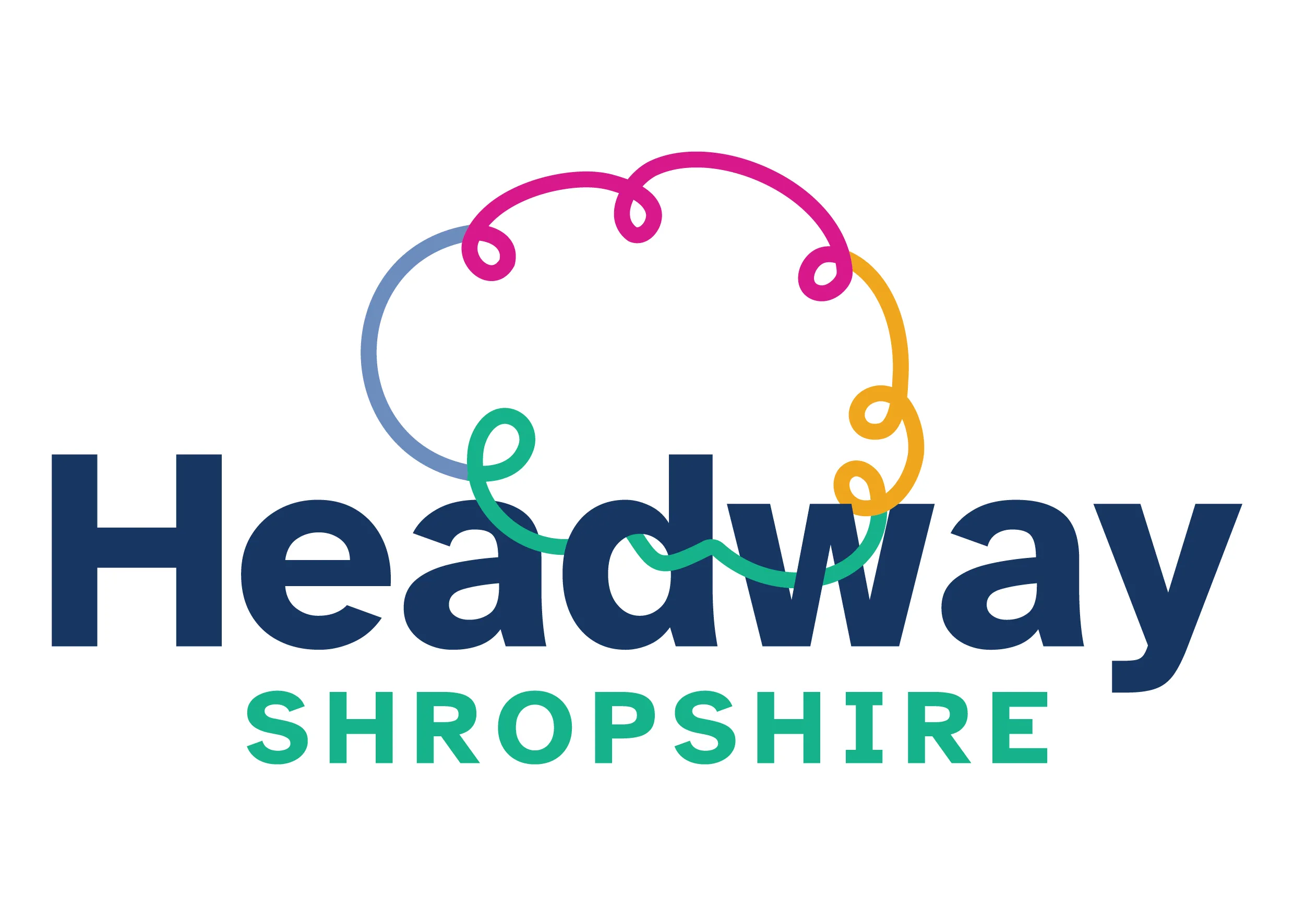
Design by Kaye Heseltine · Brand identity. Explore the related service
The starting point
Headway originally asked me to refresh its existing logo. As we worked through it together, it became clear that a light tweak wouldn’t give the charity the confident, recognisable identity it needed. The project grew into a full redesign.
The design
Recovery is rarely a straight line. I drew a brain in one continuous, looping line that keeps going, intertwining with the Headway name to reflect the charity’s support at every stage of recovery.
The finished identity
Brand guidelines and supporting assets give the team a clear, consistent way to use the identity. The new logo was also prepared for the charity’s launch-event signage.
-
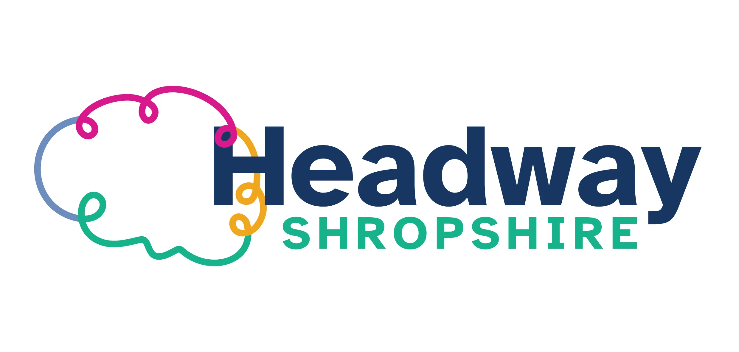
A flexible horizontal lockup -
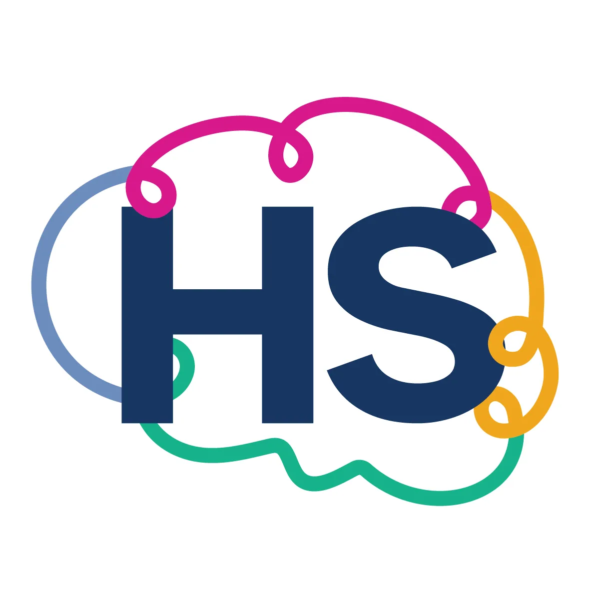
The looping brain and HS submark
We love the new logo and branding so much. It perfectly captures the optimism, personality and modern direction of Headway Shropshire.
Could your story be next?
Book a free 20-minute brand review and let’s talk about where your business is heading.
Book your free brand reviewNext project: Matthew Jones Plantscaping